/‘pasij/
Liminality of the Elevator
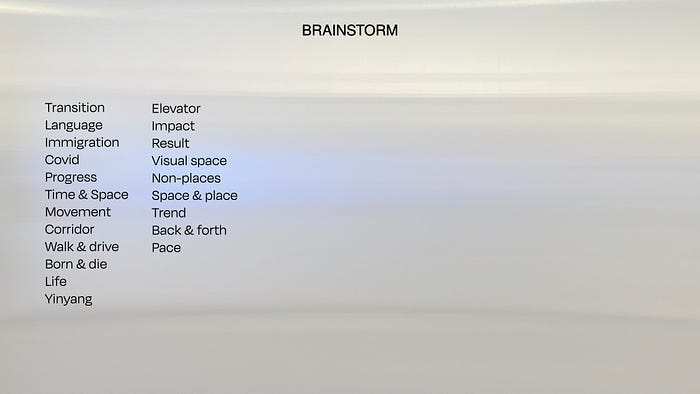
We are currently in a liminal space where life in the covid situation is going back to normal. The term liminality has been used a lot in anthropology. I started of define the definition of liminality and what could be liminality. The mindmap helped me to navigate what my possible interests could be — born & die and elevator transists us everyday is a liminal space.
Then I collected moodboard images that are pictures I and inspirations from others work.
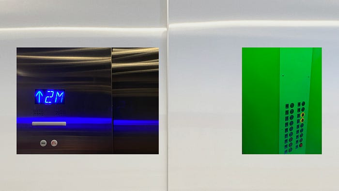

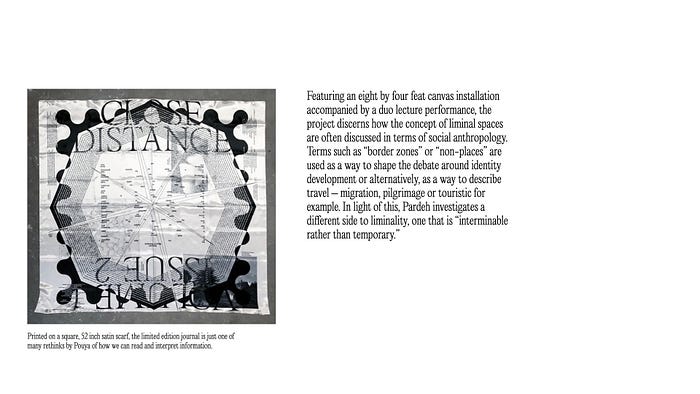
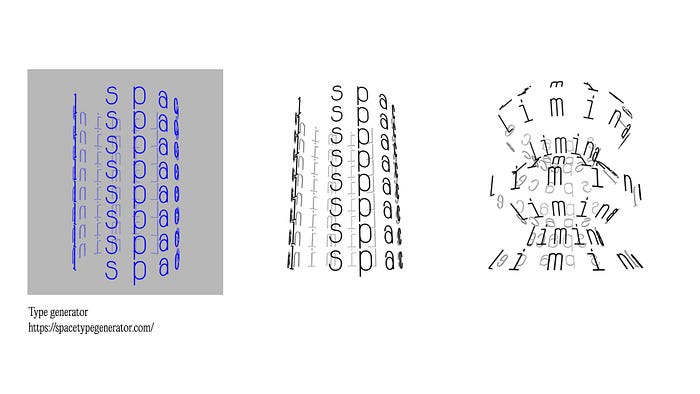
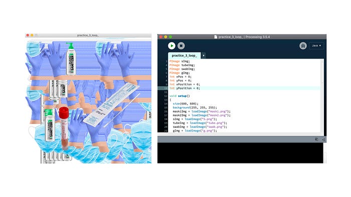
At this stage, I did not really decided a concrete concept. I kept asking my self if I want to visualize something, what would it be. It is the elevator. I touched ground and generated my concept.
Liminality of the Elevator
Hallway, tunnel, corridor, etc. We can easily identify the shell of a liminal space. But we often neglect the carrier/passenger that moves through liminality. Unlike other common carriers, the elevator moves up and down, with limited and encapsulated inner space, resulting in a blinded sense of transition during its ride. In these countless short rides, most people simply do nothing (maybe more cell phone browsing with 5G!). But interesting attempts were made to fill the void — overwhelmed advertisement, elevator pitch, map, and signage, etc. COVID also tweaks it a bit with fewer people but more signs contained. By reiterating the visual, audible, touchable impression of my elevator rides, I hope to reconstruct such commonly ignored liminal space and explore inspiration from it with my audience.
I wrote a simple poem to manifest my idea of inspiration is herer — liminal space where we usualy blame about or ignore.
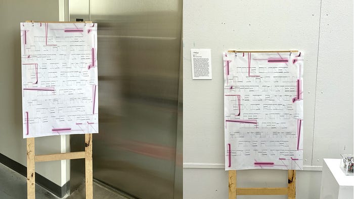
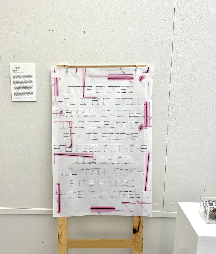
Door closes, you stand still, trapped in steel.
Time is running, box is rising, you feel nothing.
Door opens, you walk away, five floors above the street.
Then I focuse the materiality, texture and lighting of elevator’s internal space. I exprimented with typeface design. I preset a system of visualizing the vertical and rectangular space with a rectangular outline shape. Also, use the lines to illustrate the lighting. I was very excited at this point because I pushed myself to consider the limitation of a printed/analogue work and this is my first time of producing a typeface.
Here are the first round examples. Then I decided to go with the right one with no cureve lines.
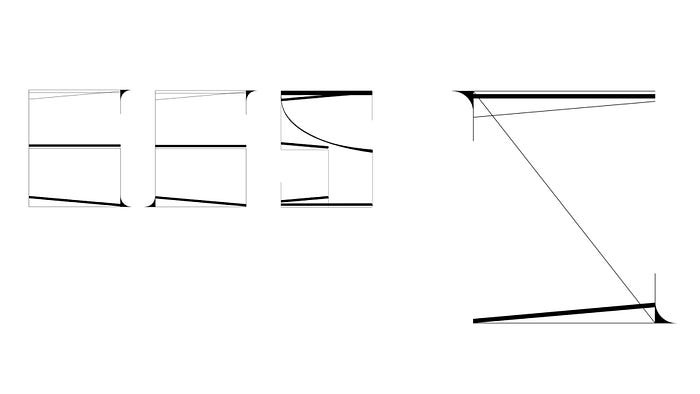
Before I had my poem done, I was experimeting how can the typeface perform in a composition.

The feedback for this experimentation was positive. However, it font is itself was just an AI vector file. So I started of searching how to transfer an AI customized font to an OTF format. There are two ways to do that — using Fontforge or Glyph. I watched tutorials on Fontforge, and upload each letter to it. The process was a bit fun because I thought the font was succesfully produced, but the tracking and kerning was terrible. I went back to the Fontforge file and adjusted the typography setting.
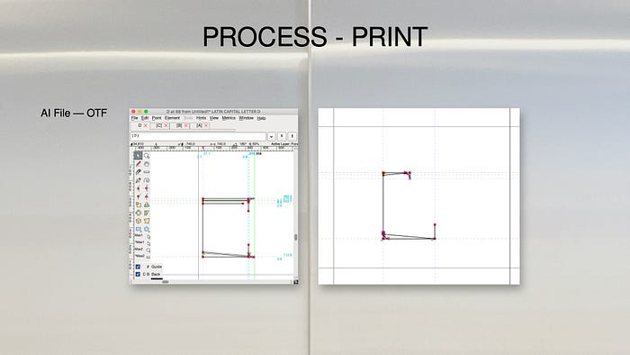
…Then, my first font was born!

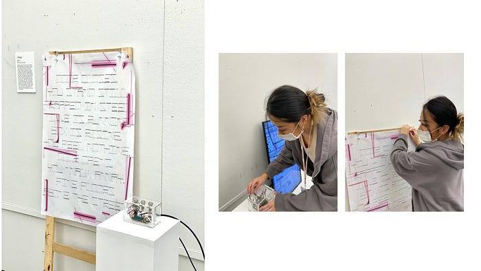
I wanted to print the poem on fabric as a flag to manifest my concept. And I the material itself is flexible to be performed or placed anywhere in terms of accessibility. I tried to reach out different places and people see how it can actually be produced. Fenway Group is the one professor Yael recommended, and it turned out very beautifully.

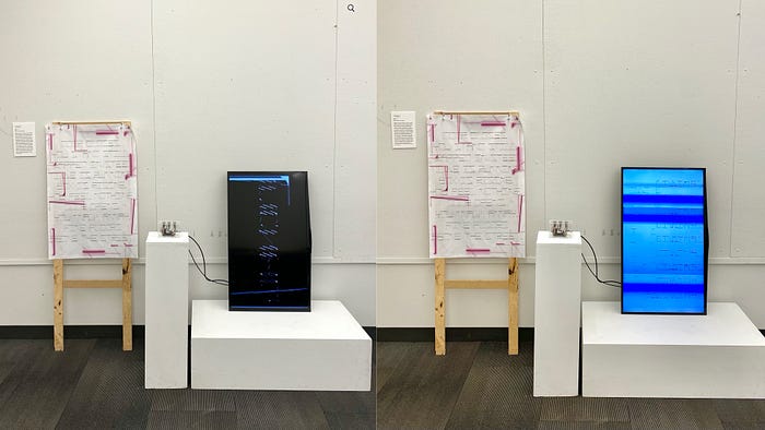
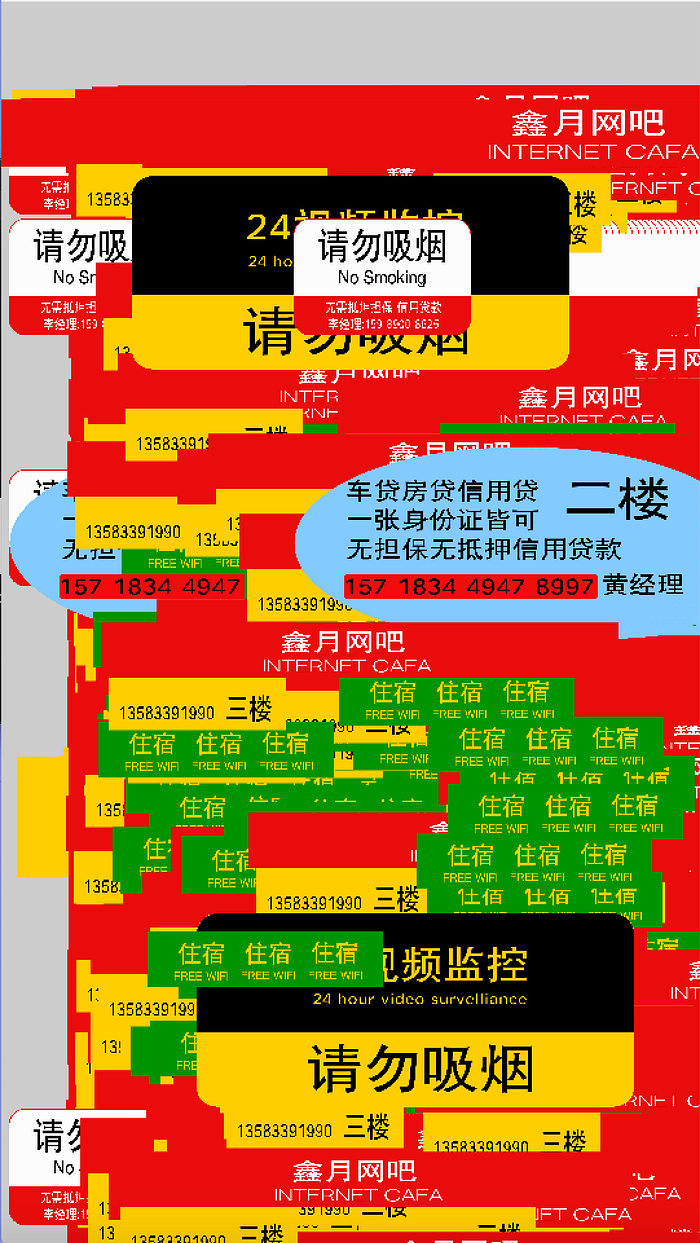
For the digital work, I wanted to reveal the action of pressing down a botton, so I targed to make touch board interaction. To keep the visual style consistantly, I abstracted the three key rationals which are kinetic typography of the /’pasij/ typeface design, Chinese advertisement in the elevator, and a generating scanned elevator internal space with sound. The Kinectic typography explored what the possible motion graphic of the font could be while maintaining the similar lighting and spacing experience. The intention of the overwhelmed adverstisement video is to visualize the common scene in elevator in China. The filmed elevator video is to contextualize its materiality. The sound of pressing down buttons and doors opening and close makes audience to exprience the time of ‘waiting’ again.
During the process, a suggestion James provided is to keep the tone of the ads video as consistently as the other videos. So, I desaturated the color and the shape of the box as the other videos. All of the video are done by both Processing and AfterEffect.

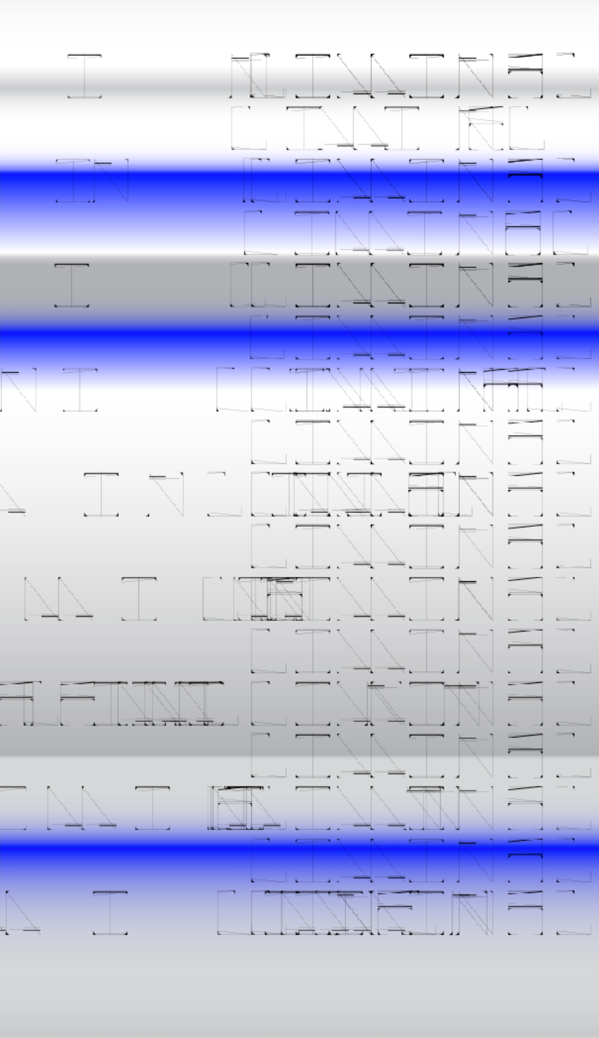
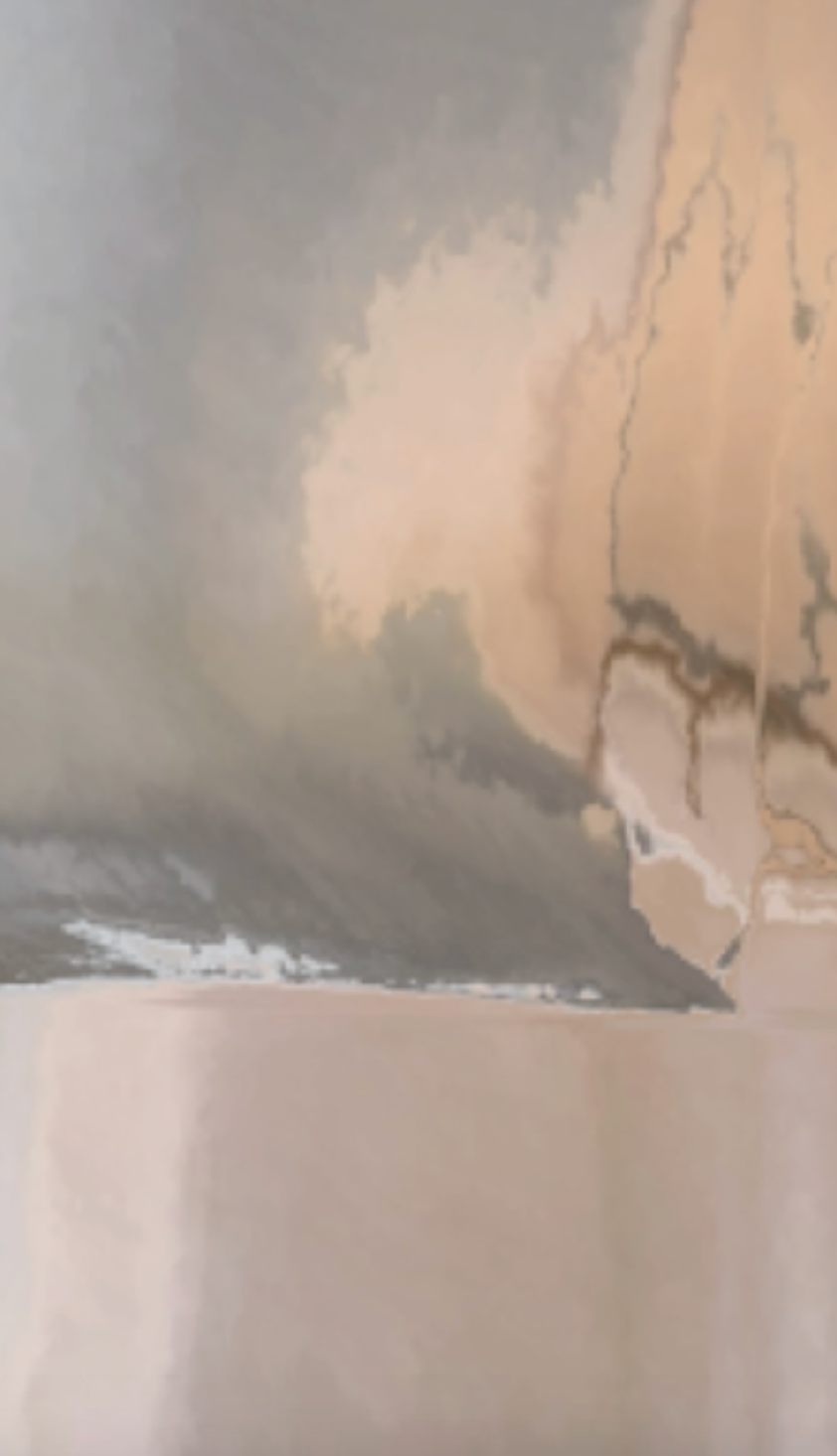

The most difficult part is to transfer a programmed work (videos) to a physical objects (bottons, monitor and an aduino board — rasbery pi. I first made the button by connecting with plumpers, electrical wires, ect. It was super hard to understand the circuit diagram, but my fiance also tried to help me interm of the electrical part. Another challenge is to set the screen vertically while matching the arduino limitations. I also followed the tutorial I found as shown below.


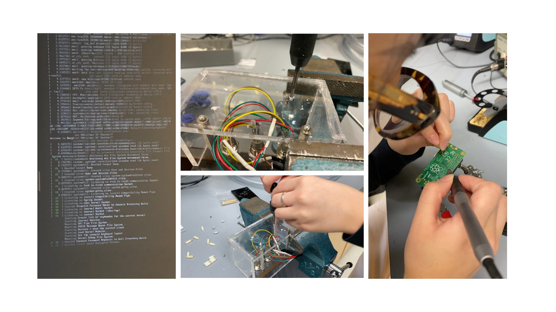
The final installation is curated as the images below.
Audience should be able to press the button #1; #2; #3 to each video.
